New users need clearer early guidance
New users may not immediately understand what they can do in the app or where to begin after signing up.
Intended outcomeSupport first-time activation
Improving New-User Activation and Subscription Discovery
An independent UX concept study exploring how onboarding, app security, and recurring-payment discovery could make an e-wallet experience clearer for new and returning users.
This project was created as an independent educational concept study and is not affiliated with or endorsed by DANA.
Start with product understanding, confidence, and a reason to return.
E-wallet apps need to help people understand the product quickly, feel safe using it, and return when they have recurring payment needs.
This concept study explored three moments in that journey: first-time onboarding, account protection, and recurring pulsa purchases.
Opportunity areas explored without implying live business performance.
Rather than measuring live business performance, this study explored product opportunities that could support first-time activation, user confidence, and recurring purchase consideration.
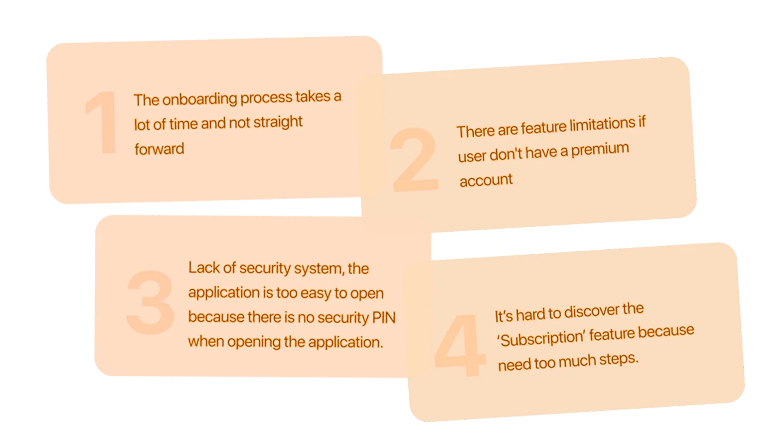
New users may not immediately understand what they can do in the app or where to begin after signing up.
E-wallet users need confidence that their balance and payment activity are protected, while still being able to access the app smoothly.
Users who purchase pulsa regularly may not notice that they can turn a one-time purchase into a recurring subscription.
Two concept personas shaped the flows selected for the prototype.

Has limited familiarity with e-wallet features and needs clear guidance during sign-up and early use.

Purchases pulsa or bills regularly and may benefit from a simpler way to repeat the same transaction.
Five focused steps from public-pattern review to formative prototype testing.
Reviewed e-wallet competitors and public user feedback to identify common onboarding, security, and recurring-payment patterns.
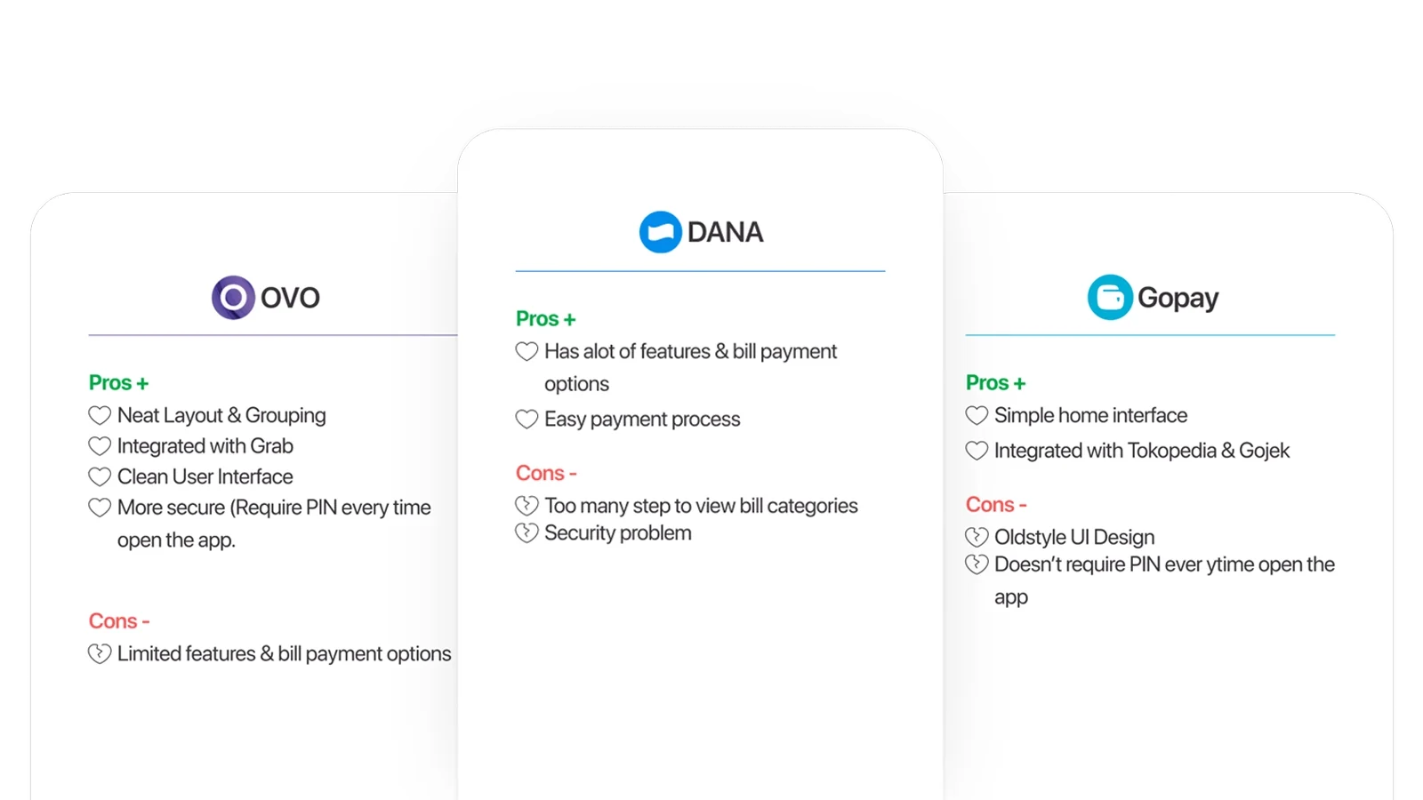
Turned recurring observations into three opportunity areas: clearer onboarding, optional app protection, and contextual subscription discovery.
Mapped the path from sign-up to first use, then explored how users could discover and activate recurring pulsa purchases.
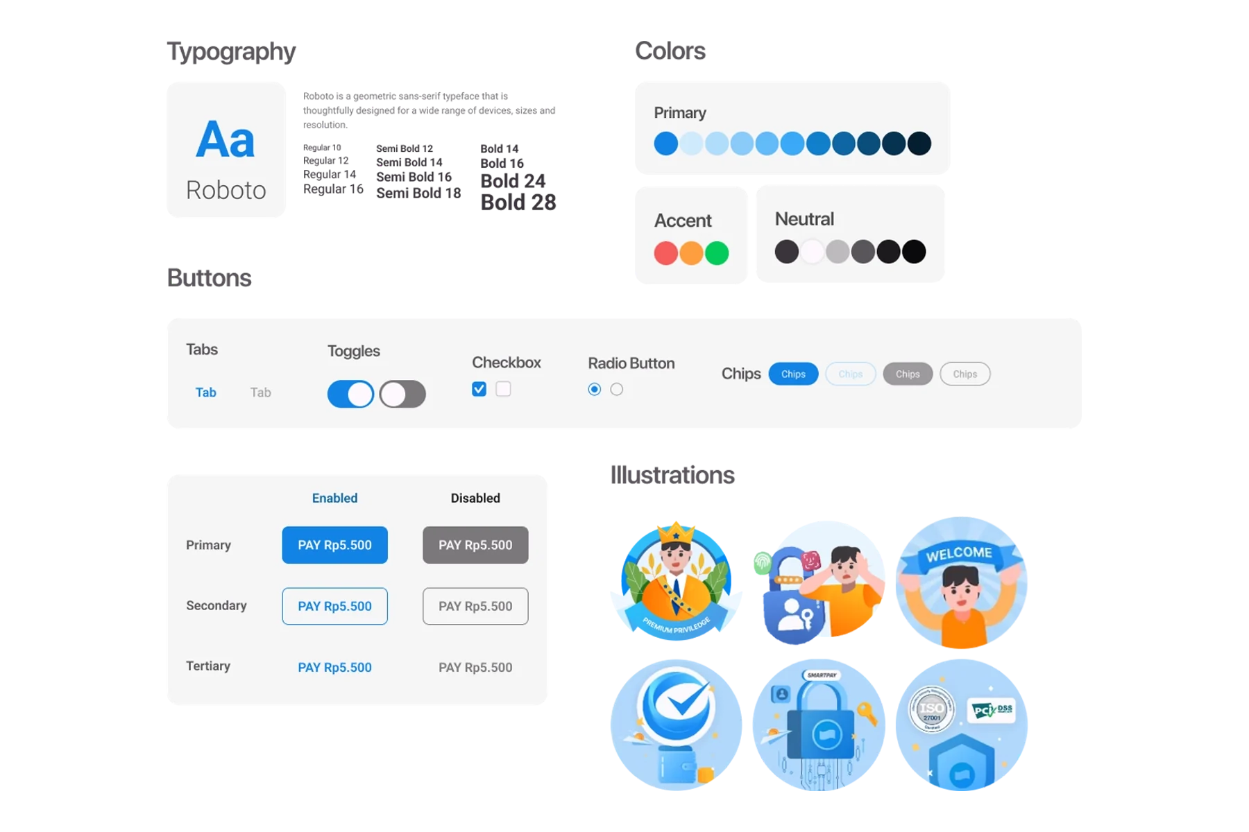
Created a mobile design system and interactive prototype for the selected flows.
Conducted three exploratory usability sessions to observe how participants moved through onboarding, app access, and subscription tasks.
These sessions were formative and directional. They were used to identify early usability issues in the prototype, not to validate live product performance.Three concept directions paired with early usability signals, not live product claims.
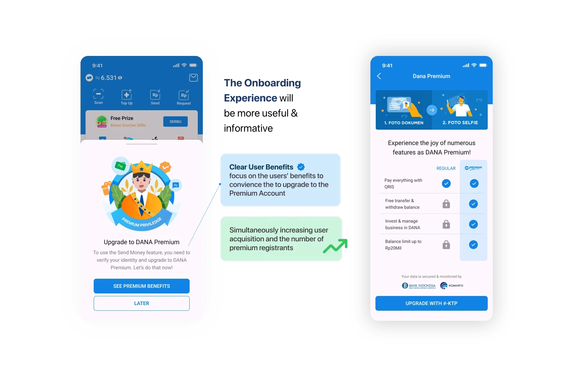
Instead of only introducing feature names, onboarding explains what each key feature helps users do.
Participants found the onboarding informative and did not consider the longer introduction a major issue.
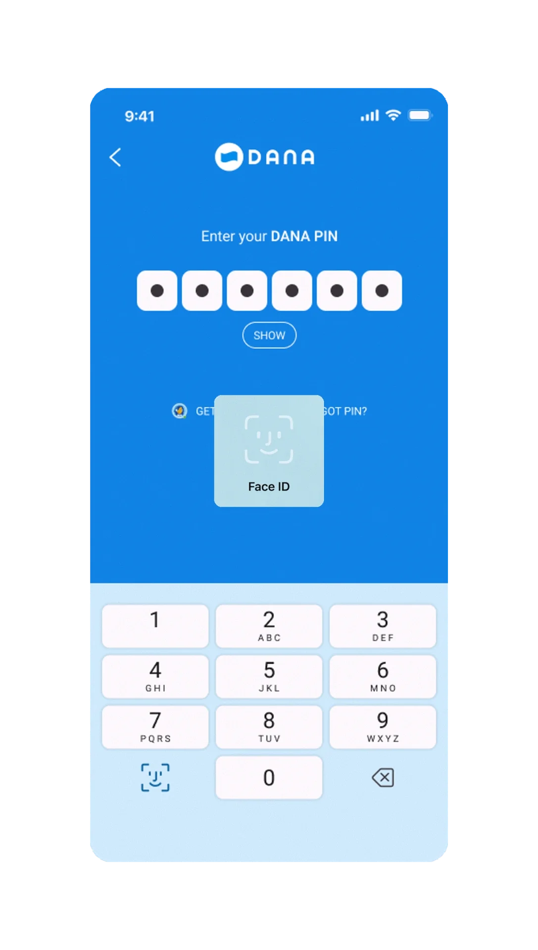
The concept explored an optional app-lock setting with PIN or Face ID for users who want stronger protection, especially on shared or frequently accessed devices.
Participants considered account security important and responded positively to the added protection step.
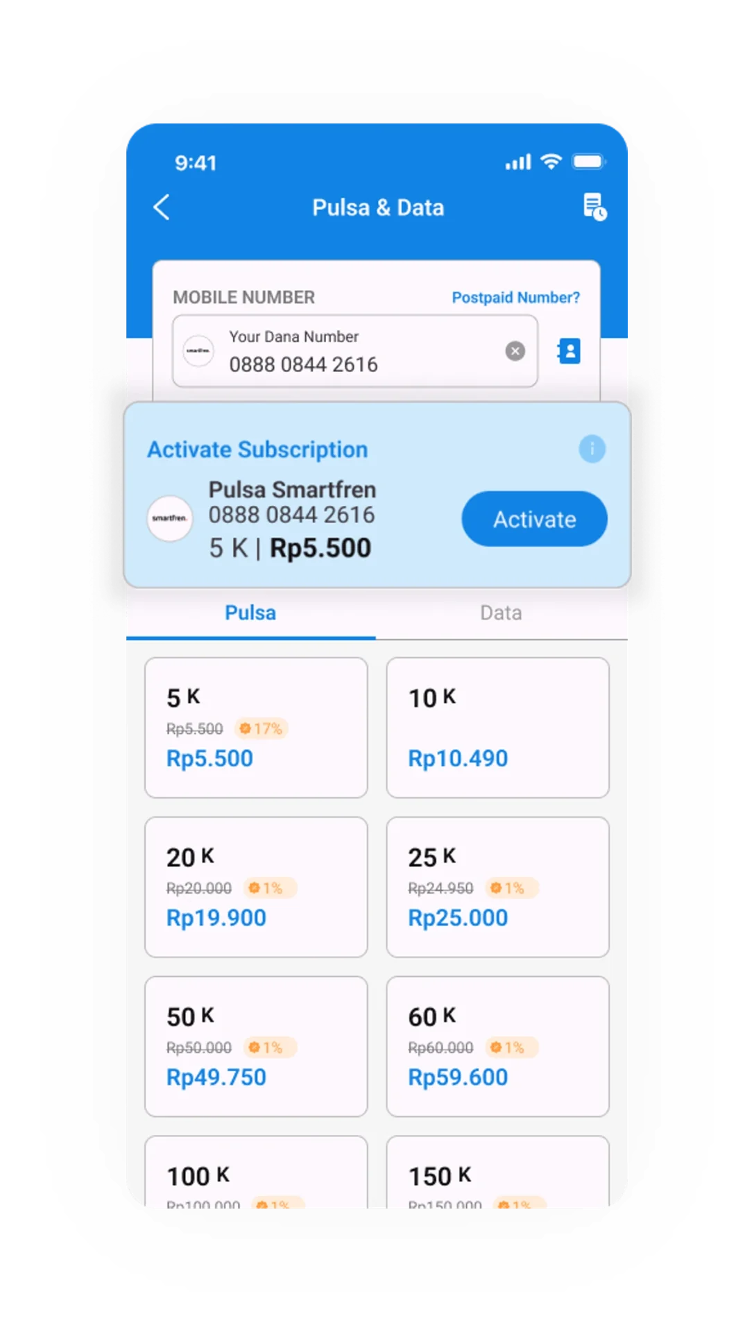
A subscription shortcut appears while users purchase pulsa, making the recurring option visible before they leave the transaction flow.
Participants became more aware of the subscription feature, but the “add bill to subscription” task had the lowest direct success rate during testing. This indicated that the entry point and wording still needed iteration.
The next iteration should make the subscription entry point clearer, distinguish one-time purchases from recurring payments, and explain schedule, payment source, cancellation, and low-balance handling more explicitly.
A learning-led final project, not a production product result.
This case study was created as my final project and graduation requirement for the Hacktiv8 UI/UX Design Bootcamp.
Through this project, I explored how research observations, user flows, interface decisions, and usability testing can be connected into a more intentional product experience. The work received the Teacher Award with a total score of 99.2/100, and I graduated as the top graduate of my batch.