PT Pilar Teknik Infrastruktur / Brand Guideline

Pilar Teknik Infrastruktur Brand Guideline

Type
Brand foundation
Client
PT Pilar Teknik Infrastruktur
Year
2026
My role
Brand identity & guideline design
Scope
Visual identity, stationery & report cover
Status
Brand guideline

Construction & Meaning

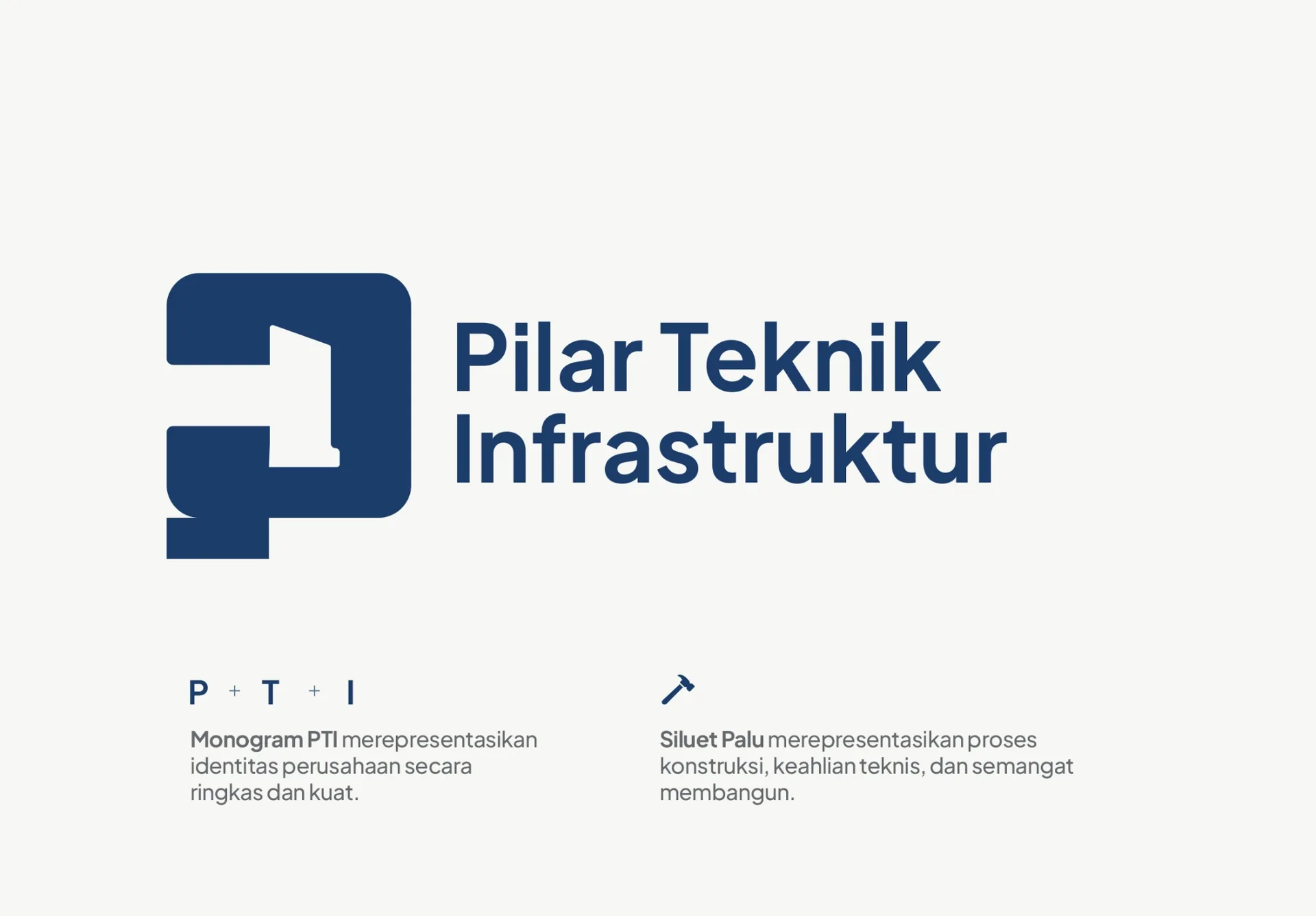
MONOGRAM P + T + I /
TECHNICAL CRAFT / FORWARD
MOVEMENT

Colour, held as a system.

Four colours, each assigned a clear role.

Primary colour

Deep
Navy

#1B3D6B Professional · Stable · Technical · Corporate · Trusted

Orange#D4642C · Active · Technical · Construction · Energy
Charcoal Black#25282A · Strong · Industrial · Direct
Concrete Grey#8B8F8E · Material · Concrete · Stable · Utilitarian

Type sets the tone.

Jakarta Sans supports a clear and practical hierarchy.

Typeface
Jakarta
Sans

Plus Jakarta Sans / Bold, SemiBold, Medium, Regular

Pilar Teknik
Infrastruktur
Bold 700 / Headings
Clear information for technical work, project communication, and formal documents.Regular 400 / Body
0123456789 / Aa Bb CcMedium 500 / Labels

Letterhead

A consistent layout for official communication.

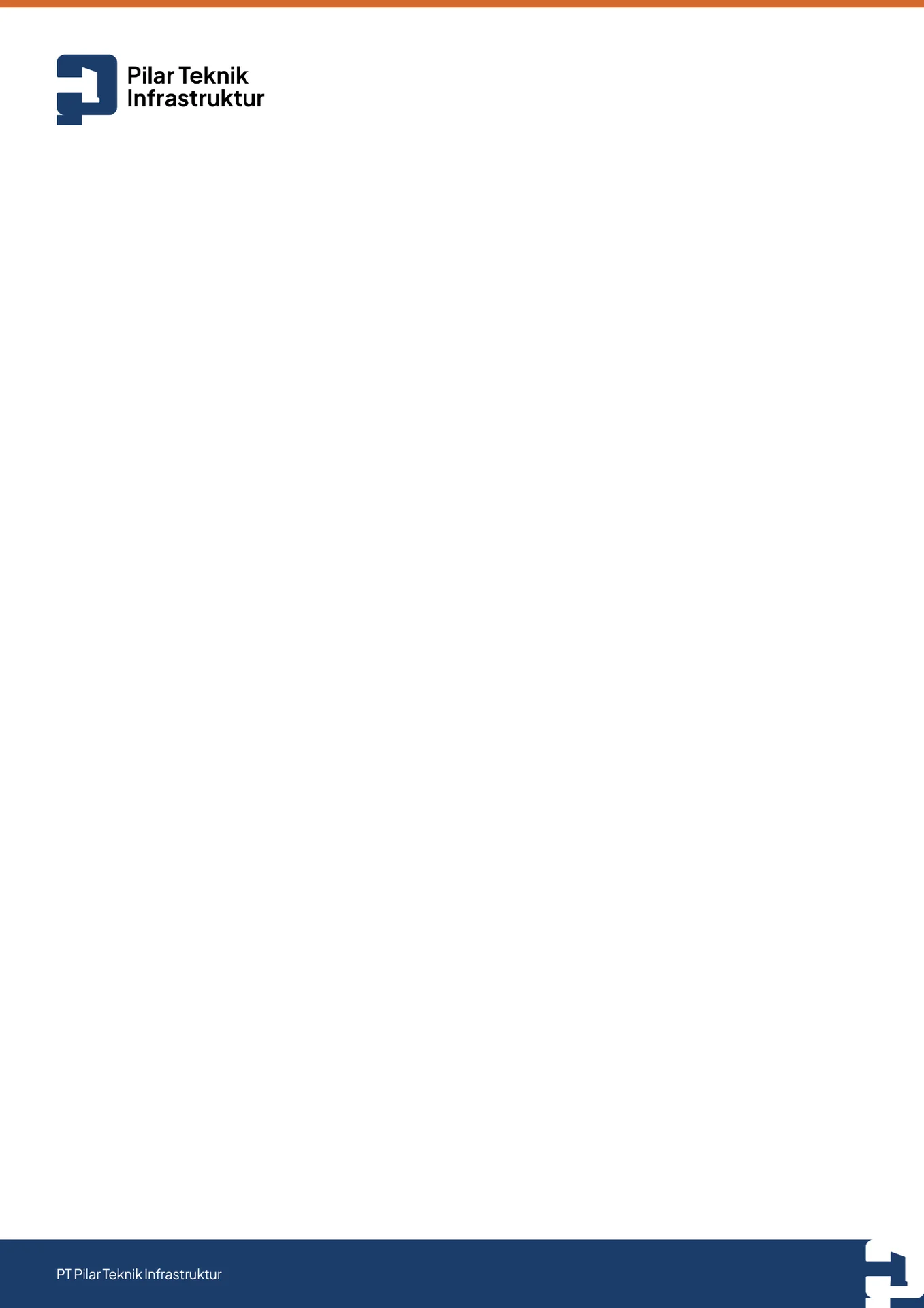
Official document layout

Every official page starts from the same system.

The letterhead keeps the logo, document space, and company identity aligned across formal correspondence.
Business card

A small, clear introduction.

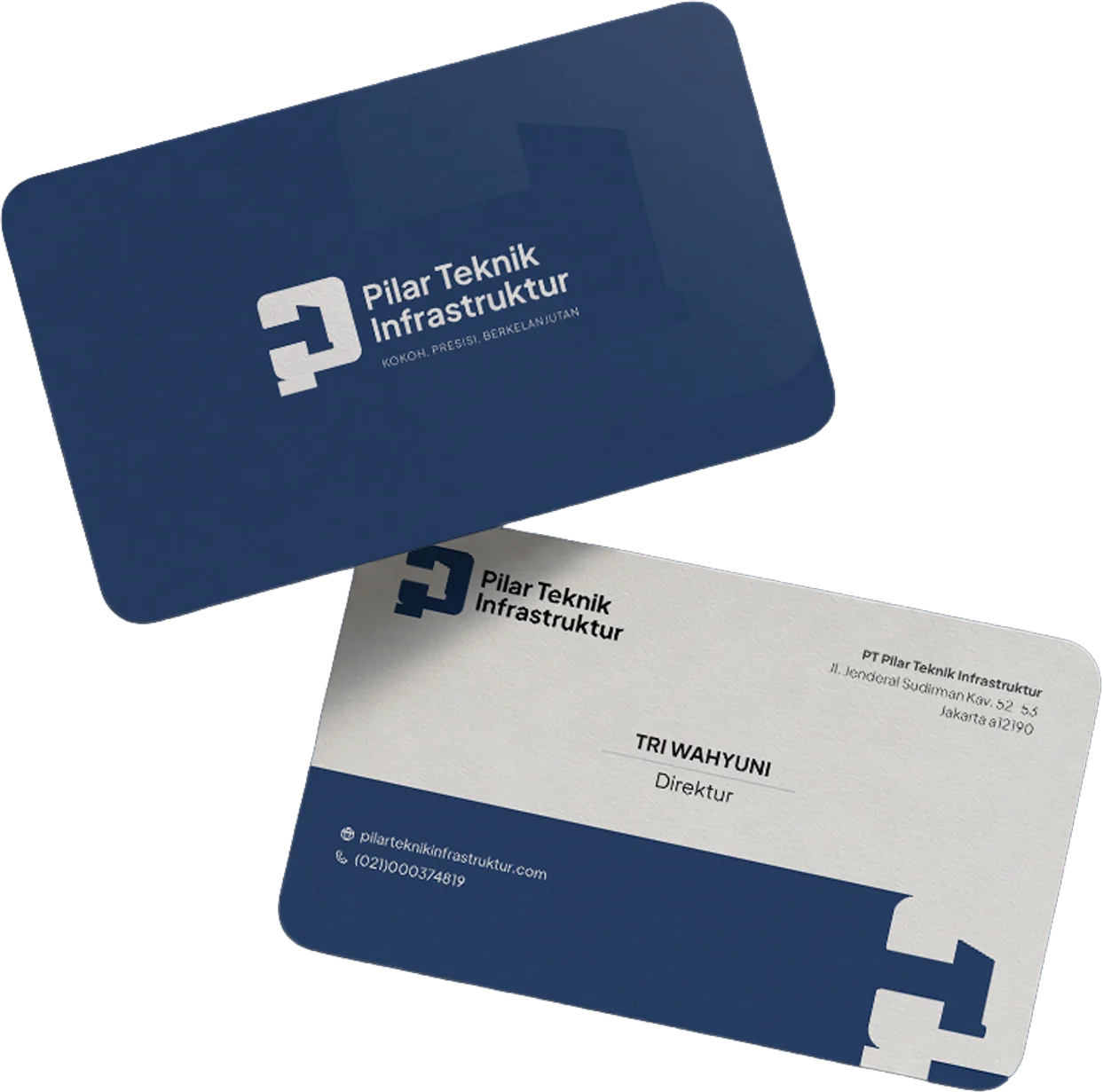
Business card

One presentation image, two sides of the identity.

The card uses the primary mark, strong contrast, and clear contact hierarchy for an immediate introduction.

Company stamp

A mark built for the formal record.

Stamp design

Visible when it needs to carry authority.

The company stamp brings the PTI monogram into formal documents and administrative records with a compact, recognisable mark.